New features in Attender’s student and school leadership interface
More clarity, more transparency, better decisions
Attendance is rarely just about numbers. It’s about patterns, development, and noticing issues before they grow too large.
That’s why we’ve launched a series of new features in Attender, giving both students and school leadership a clearer, more actionable overview of attendance throughout the semester.
The updates make attendance easier to understand, more transparent, and easier to act on.

A stronger student interface
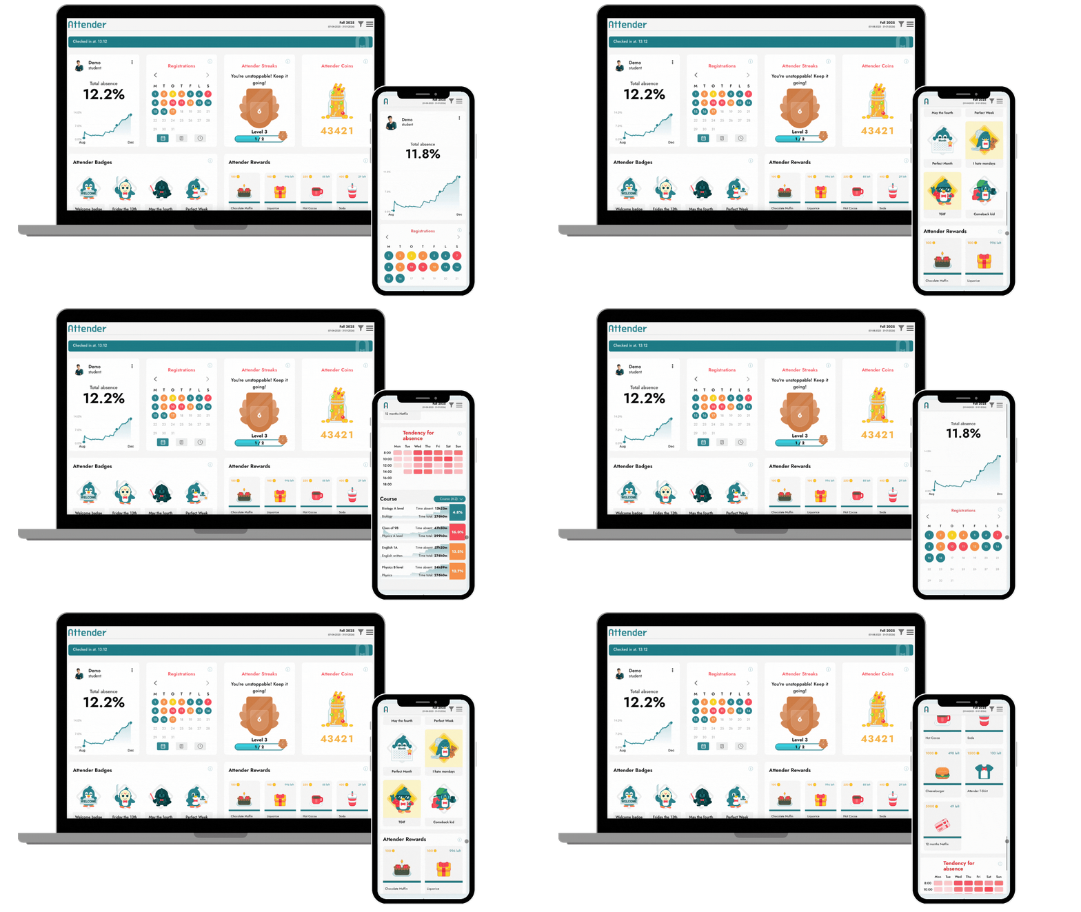
Students now meet an updated interface with new visual tools that make it easier to understand their attendance over time.

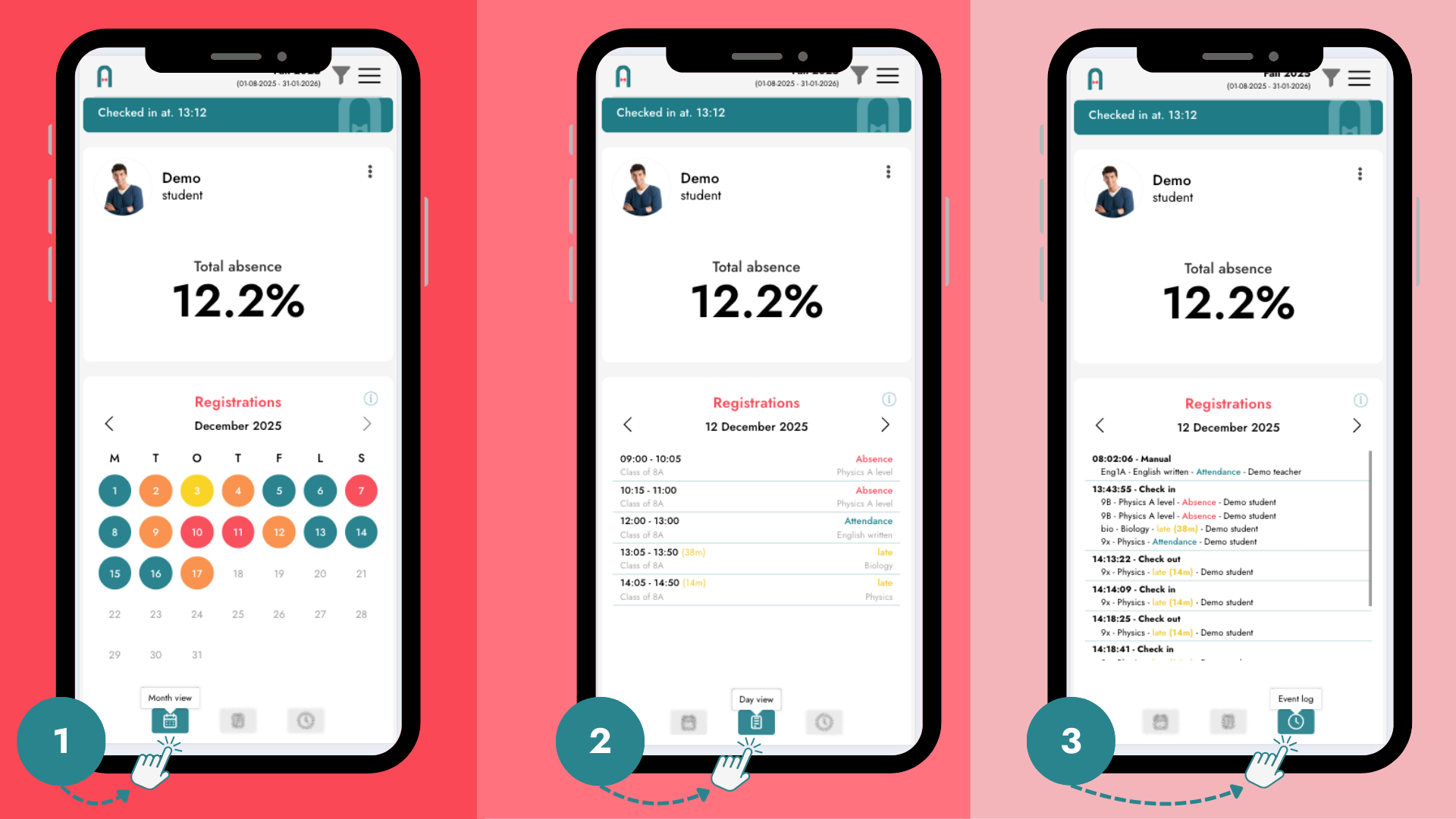
New calendar view
The new calendar view provides an intuitive month-by-month overview of attendance:
- Green – present
- Yellow – late
- Orange – mixed
- Red – absent
The colours make patterns instantly visible and help students see how their attendance develops over time. They also provide a quick overview of the monthly distribution of absence. Students can simply click on a day to view a detailed breakdown.
Full event log
Students can now see everything that has been logged about them in a complete event log, including:
- when a teacher registers them as late
- if a registration is later changed to full absence
- other attendance-related changes or events
Transparency builds trust. When students can see and understand what is registered, attendance becomes something they engage with – not something that happens to them.
Attendance visualised across the semester
We have revised and introduced a new graph that shows attendance distributed across the entire semester, with clear highlight points — for example periods of particularly high absence.
This gives students:
- insight into where they stand right now
- an understanding of how their attendance develops over time
- the opportunity to react earlier if absence begins to increase
An improved school leadership interface - from status to action
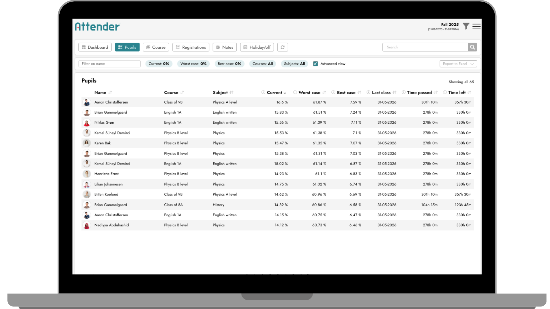
We’ve also upgraded the interface for school leaders and staff with a new advanced view designed to support better, faster decision-making.

Projected absence: What happens next?
With projected absence, staff can see how a student’s final absence rate will look based on future attendance behaviour.
The system shows:
- Worst case: if the student is absent for all remaining classes
- Best case: if the student is present for all remaining classes
This makes consequences clear – not as a threat, but as a factual and transparent overview.
Time remaining in the semester
The interface also shows how much time is left in the semester, helping staff understand:
- what can realistically still change
- when it makes sense to intervene
- which actions are likely to have an impact
Faster overview – better decisions
Instead of manual calculations or guesswork, the advanced view provides:
- a clear snapshot of the student’s current situation
- realistic scenarios for how attendance may develop
- a data-driven foundation for the school’s chosen strategy
This supports better dialogue, prioritisation, and timely intervention.
One shared data foundation – better conversations
With these new features, students, staff, and school leadership work from the same data foundation – presented at different levels.
This makes conversations about attendance:
- more concrete
- more transparent
- less based on gut feeling
The goal isn’t control, but understanding, ownership, and better decisions at the right time.
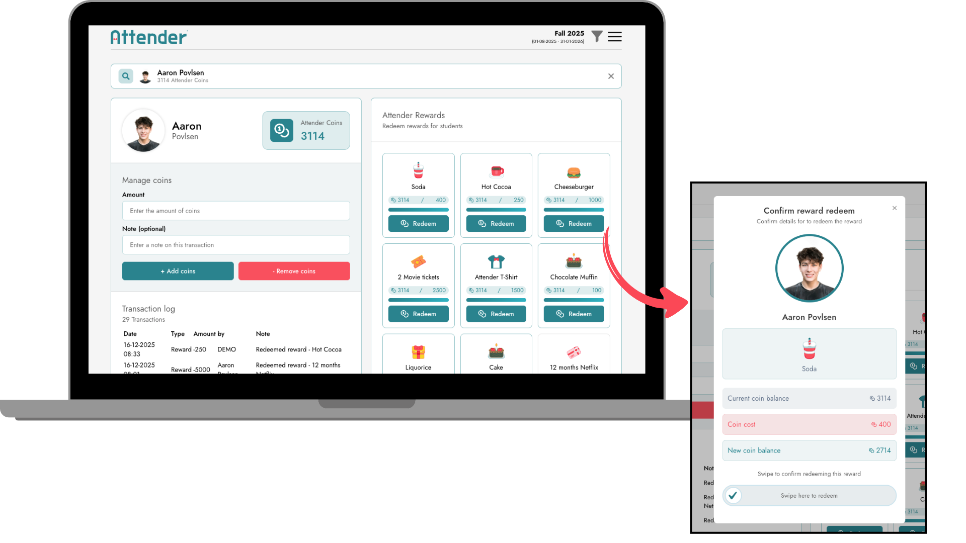
New coins redeem interface
Staff can now navigate between the different functions even more easily and quickly.
Simply search for a student by name and redeem rewards as needed.


